RSS Feed

2011

    Kelas Asas Decoupage April 2018

    BungaTelur.com akan mengadakan kelas untuk mempelajari teknik decoupage di atas pinggan seramik/cermin kayu. Semua bahan akan disediakan. Hasil kerja boleh dibawa balik.

    Jadual kelas adalah seperti berikut:

    Tarikh: 29 April 2018, Ahad

    Masa: 2:00 - 5:00 petang

    Yuran: RM80

    Tempat: Puchong (lokasi akan diberitahu kepada peserta yg serius)

    Terhad kepada 6 peserta

    Sesiapa yang berminat, sila email ke [email protected], atau sms/wa ke nombor 012 6482121 untuk maklumat lanjut. Peserta digalakkan membuat tempahan awal kerana tempat adalah terhad.

    Untuk melihat contoh decoupage yang dihasilkan oleh peserta kelas sebelum ini, sila lawati http://news.bungatelur.com atau laman Facebook BungaTelur.com

  1. The Rose Is Blooming

    April 28, 2011 by admin

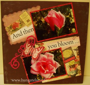
    I almost didn’t make it for the challenge Scrap-it-Lah 2nd Anniversary Bloghop: Week 4 because my printer was out of inks..huhu! Luckily Dear Hubby has been so sweet to go to the nearest shop today (as on Wednesday) after work and bought me new inks. He even baby sit our son for a few hours so that I can get down and do the layout peacefully.

    (Please click to view the full size picture)

    And the best part is the new items I ordered from Simon Says Stamp 10 days ago have finally arrived. I bought Martha Stewart doily lace punch (which I have been eyeing for a while) and straight away tried the punch as you can see in the layout..hehe!
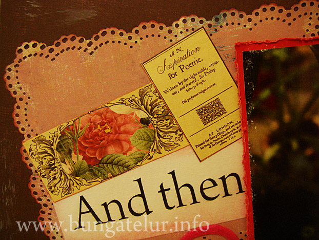
    I also bought Webster’s Pages 6 x 6 TRENDSETTER Petite Papers which some has been cut and used as a tag and a whole piece has been used on the right side of the layout. I should have bought their 12 x 12 papers as well so that I can fussy cut some of the beautiful roses.

    Oh, I managed to use few items from Jenni Bowlin range like the butterfly stamp, dye ink and her paint dabber in Malted Milk for this layout.
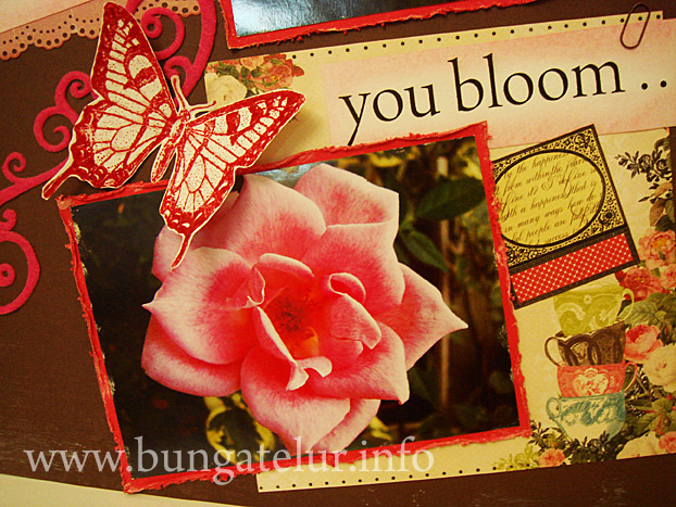
    The butterfly is stamped on a white cardstock in Cough Syrup ink. I put some glossy accents (which you can hardly see the effect in the picture) on the butterfly. Overall it is such a nice feeling to be able to incorporate all the new materials and tools I bought for this challenge. At least I don’t get to feel guilty for hoarding those stash for years to come..haha!

    I am also entering this layout for Simon Says Stamp Challenge Blog 2nd Anniversary – anything goes.

    Who knows I might be one of the lucky entrants to get some more great goodies from their store..I wish!!
  2. Eyelets on Green Layout

    April 19, 2011 by admin

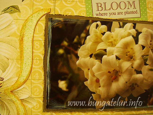
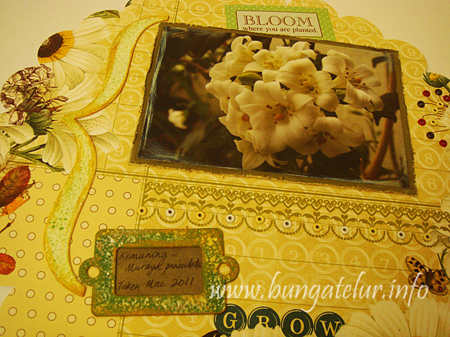
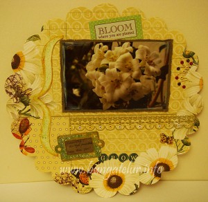
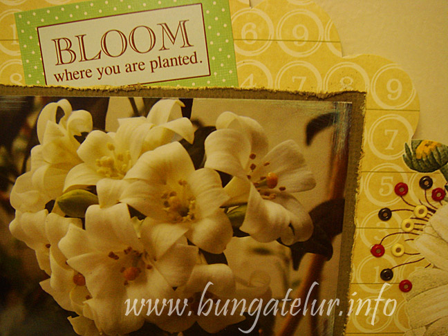
    Last week I was learning the correct technique on how to print out picture on 4R size photo paper. Sometimes using my simple way of cropping the picture in Photoshop and send them to printer doesn’t give the output that I want. After learning more about the Fixed Ratio style and resolution, I managed to print this picture of Murraya paniculata or Kemuning flowers.

    Please click to view larger image

    The challenge that I am up to this month is to use a minimum of 23 eyelets on the layout. Check out Scrapbookers Anonymous April Challenge.

    I hardly use the bunch of eyelets I bought in 2006. Reason being I hate making holes for the eyelets to go through. I’m not sure whether there exists such updated tools that will make the task easier. I’m still using the ancient tool I have to make the holes..huhu!

    On the right side are the first 10 eyelets I put on the layout. I also found a sentiment sticker that fits the gardening theme for this layout.

    Since I was using the Webster’s Pages Wonderfall diecut paper for this layout that is already beautiful, I tried not to embellish it too much.

    If there’s one thing I regret doing, it was sanding the edge of the picture in a dim lit room. Only when I snapped the picture I realized how too sanded the edge became…huhu!

    For the chipboard, I used acrylic paints. I misted some paint using wet brush on top of the chipboard and painted the edge in Antique Gold.

    Oh, check out the other 13 eyelets, what a wrist workout to make all the 23 holes..huhu!

    I am also entering this layout for Scraptivations April Challenge. I just found out about the challenge while reading Bec Miller’s blog. Thanks Bec for commenting!

    I think those combination of bright yellow, cream and green are just perfect for flower theme layout like mine.


  3. Altered Door Hanger

    April 19, 2011 by admin

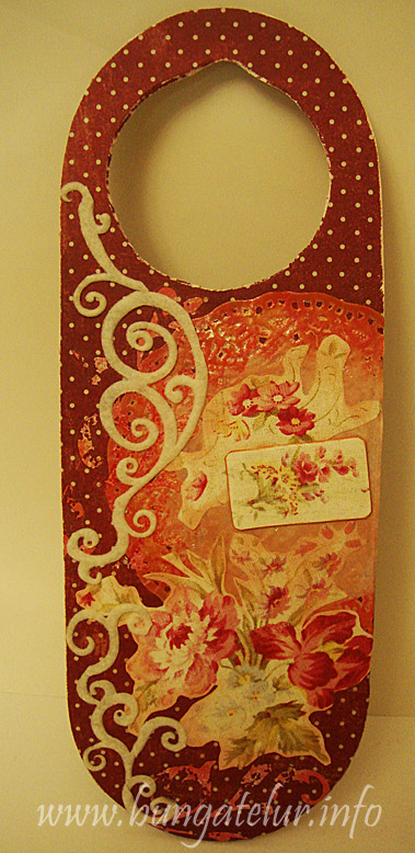
    This is the first time I do anything crafty with door hanger. I’ve got one through decoupage gang gift exchange last year, but that one was using napkin.

    I thought for the 3rd Week Scrap-It-Lah challenge I will do something decoupage like but using patterned paper instead. It is some rosy, shabby style pattern which I hardly use for scrapbook layout. I fussy cut the main flower, glued it down and inked around the image so that it blends with the background.

    90% of the materials used for this altered work are some old stuffs I bought like 4-5 years ago. Oh, I get to use the Making Memories sanding block I bought to sand the paper all around the door hanger.

    At first I used rub on from Bohemia line of My Mind’s Eye to embellish the background but it was too subtle as the background paper is dark maroon. I dug out some old Queen & Co felt self adhesive scroll in white and arranged them to fit the left part of the door hanger.

    I plan to stamp or use alphabet sticker to spell the name of the recipient on the top part of the hanger once I have decided who I will give this door hanger to.


  4. An Altered File Folder

    April 12, 2011 by admin

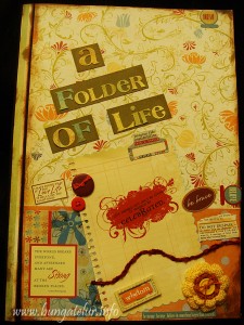
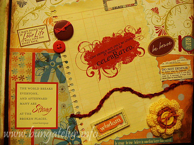
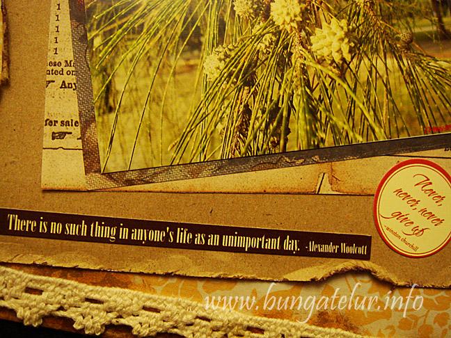
    I’ve never done altered file using patterned papers before. So this was my first attempt to use all the available scrapbooking stash. And I have never done anything with this kind of brown, yellow vintage theme.

    (Please click image to view larger version)

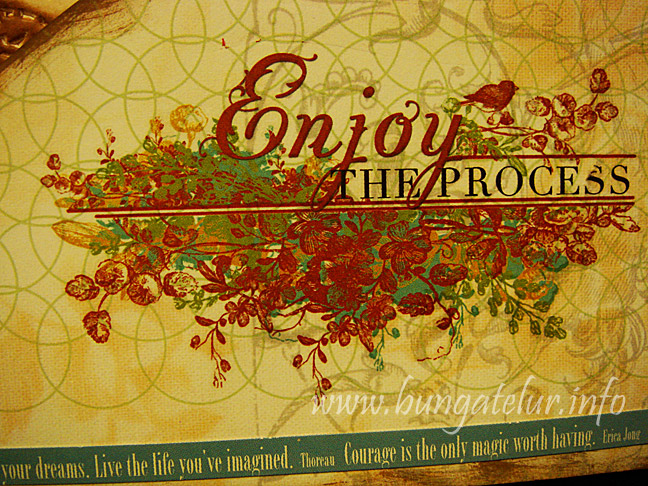
    To tell the truth, I actually chose the theme because I wanted to use the motivational 7Gypsies sticker. After matching every possible piece of patterned papers in my possession, only those yellowish, brown papers “speaks” to me. It is quite a challenge for me because I usually will go for bright colors in my layout.

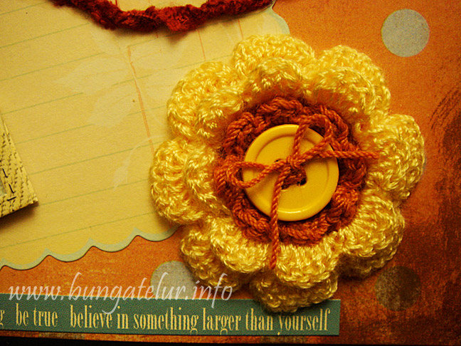
    My favorite part would be the crochet flower with button. I crocheted the flower many months ago but couldn’t find any use for it. The yellow brown flower fits the theme perfectly.

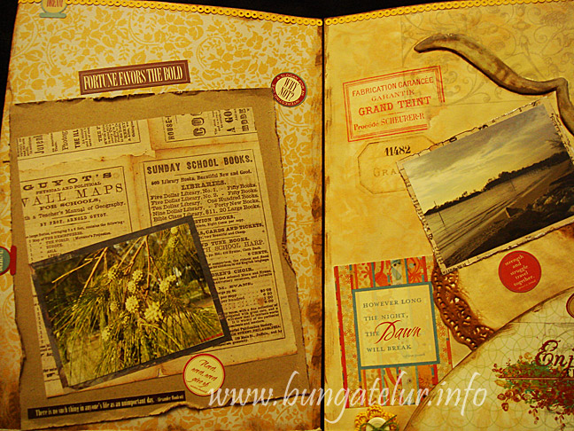
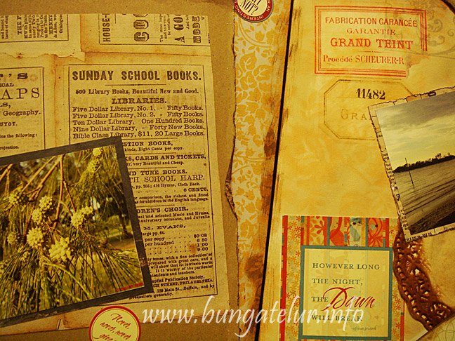
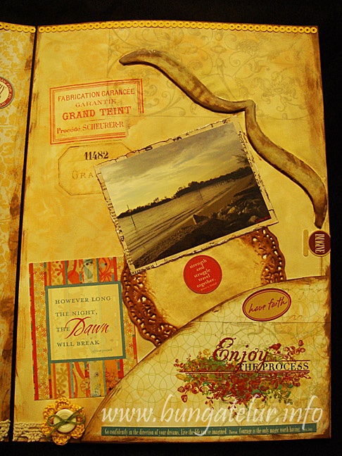
    For the inside pages of the altered file folder, I used a lot of distressing.

    I used Vintage Photo, Antique Linen and Shabby Shutters distress inks. The picture mat and kraft paper were also distressed using the Tonic Paper Distresser.

    This green tree by the seaside photo was taken 6 years ago during the trip to our wedding anniversary seafood dinner. How time flies!!

    The chipboard bracket was covered with patterned paper and distressed with inks.

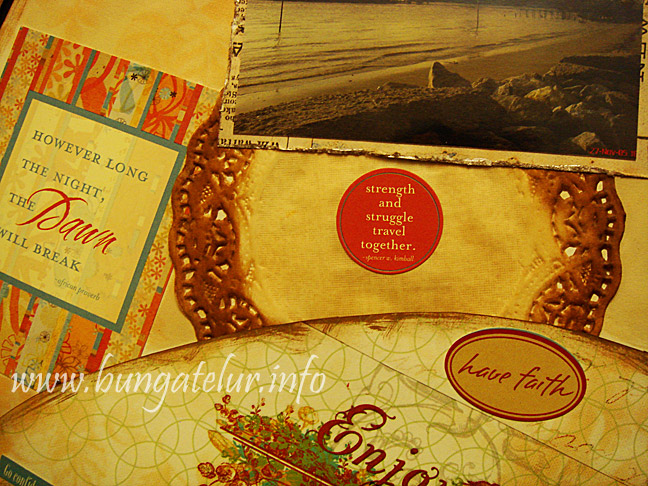
    I also used Tim Holtz distress inks on the white doily to turn it into brown yellow color.

    I finally get to use this Rhonna Farrer rub ons I hoarded many, many years ago. The sentiment and color is so beautiful that I feel so reluctant to use all of the rub ons in my previous creations..huhu!

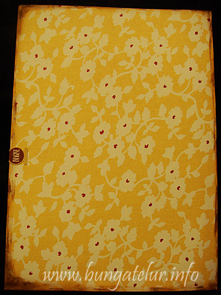
    For the back of the file folder, I didn’t embellish anything. I just used the Jenni Bowlin patterned paper I got from winning the Papier challenge last year.

    This altered file folder will be entered into 2 challenges:

    Week 2 Challenge – SIL 2nd Anniversary Blog Hop

    Simon Says Stamp and Show Some Distressing challenge.


  5. A Birthday Layout

    April 7, 2011 by admin

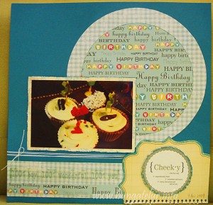
    I’m doing this birthday layout in order to take part in the Scrap-It-Lah Second Anniversary challenge. Their first blog hop is to Wati’s Creations.

    (Please click to view bigger picture)

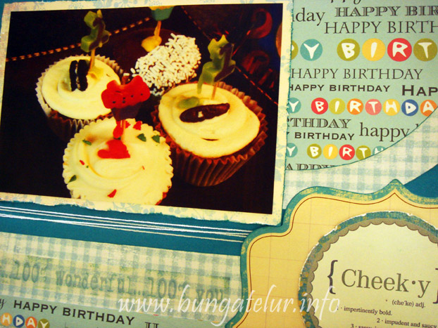
    I really would love to share pictures of my precious son celebrating his birthday, but since I can’t due to privacy and safety issue, I decided to use the picture of cupcakes we bought for his first birthday.

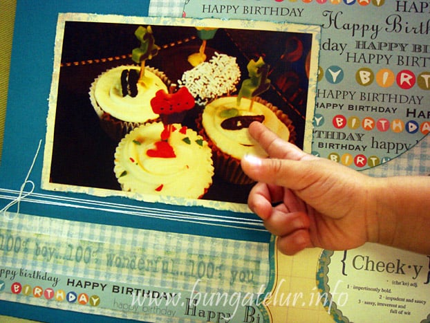
    I tried to make it as masculine as possible for this layout, thus no usage of flowers or ribbon. At first I wanted to print some journaling, but since I was short on time, I decided to use the sticker sentiment “cheeky’ to describe the whole first birthday experience.

    See the little fingers who just can’t sit still for a moment, always curious and driving Mama crazy every single day..huhu!


  6. Scrapbookers Anonymous March 2011 Challenge

    March 31, 2011 by admin

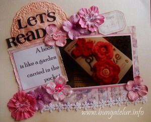
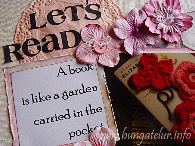
    I finally was able to make the layout for the challenge. This time the challenge is to use a minimum of 7 flowers, the premade kind, not homemade, the more flowers the merrier!

    (Please click to view a bigger picture)

    I wish I could use more flowers for this layout ( I have something else in mind ) but this is the best I could do, while having a toddler who is curious about everything. If there is an award for scrapping yelling mom, I’m sure I could win one..huhu!

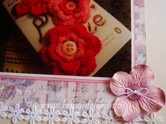
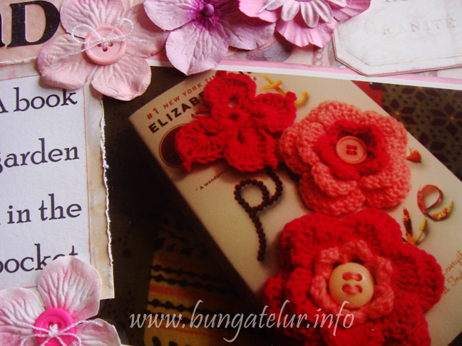
    I’m using old patterned papers I have. I think it’s Daisy D’s. The flowers are all Prima which I bought a few years ago. This time I am a little wiser as I embellished them with buttons and bows of crochet thread. If you count the one I stack on top of each other, I managed to use about 9 flowers for this layout..heh!

    I crocheted those pink flowers and butterfly as a friend requested a hair clip for her daughter. So I need to take a picture and show her how the flower looks like before I could proceed with the next step to sew the felt hair clip cover.

    And since I am currently reading Eat Pray Love by Elizabeth Gilbert, I put those crochet flowers on the book and just snap some pictures.

    Oh, this is also the first time I used doily in my layout. I distressed the doily with Tattered Rose ink. I wish I have a darker pink color to distress its edge. Well, that’s another reason to stash some more scrapbook stuff..huh!


  7. Mother’s Day Card

    March 25, 2011 by admin

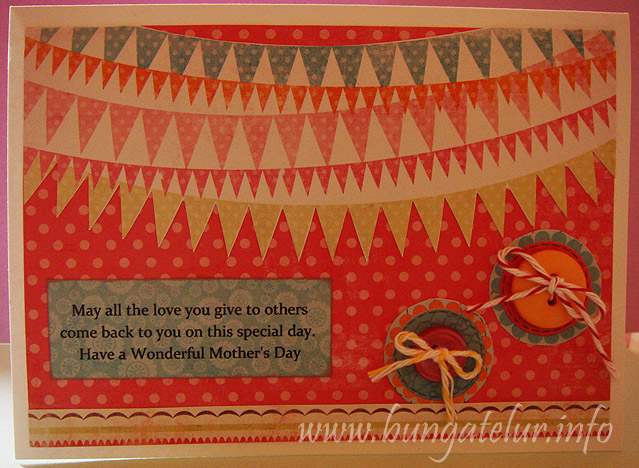
    Still in the effort to make do with whatever craft stash I have in possession, this time I am using the 6 x 6 paper pad and baker’s twine I bought from Shirl many months ago.

    It is the My Mind’s Eye Fine and Dandy collection. I am interested to use the hanging banner pattern after seeing how others implement it in their layout.

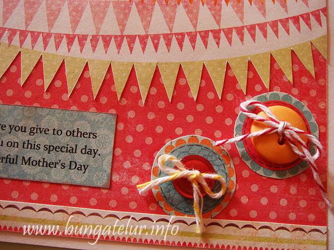
    This is also the first time I tie the twine inside the button hole. The first button was done quite well since I cut the twine quite long. For the second button with yellow twine, I decided to be frugal and cut it short before I tied them..damn..it was hard to fumble with a just-enough-length of twine..as you can see the twine ends all loose up as the consequences..huhu!

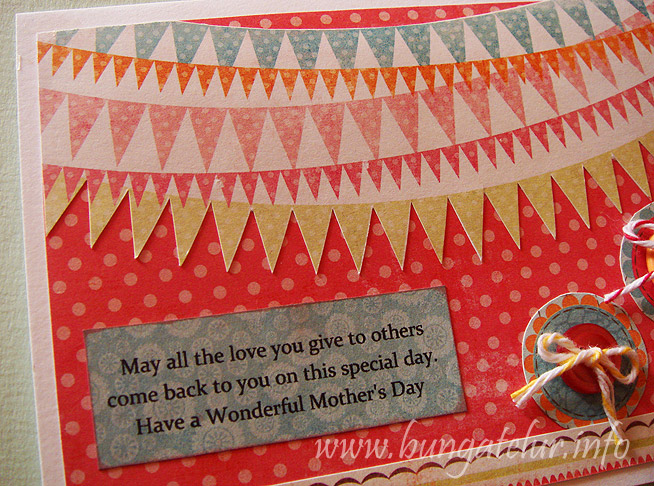
    I also tried to print the Mother’s Day sentiment on patterned paper. I printed a trial piece on plain paper and then I glued the piece of patterned paper at the area where the first piece was printed on.

    I should have use repositionable glue as the Glue Dots that I was using were too strong..huhu!

    Well, at least I learned a few new tricks doing this simple Mother’s Day card.

    I am entering this card for Simon Says Stamps Challenge – Mother’s Day/Girlie.


  8. Altered Art Notebook Cover

    March 22, 2011 by admin

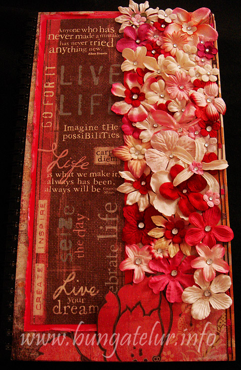
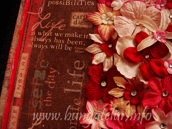
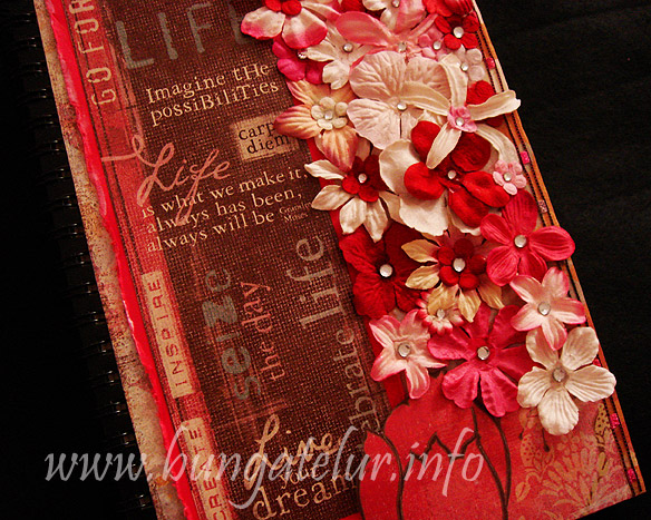
    The other day while on FB, a friend mentioned about hoping to get another hand made covered diary. I made one for her when we were like 14..haha! So while rummaging the stack of craft stash I have in my craft room, I found this A5 size notebook I bought at Daiso.

    I’ve seen many crafters altered the cover of notebook and clip board. I thought perhaps I should try to make one. I also found the glossy Mod Podge I bought about 2-3 years ago. Since it should dry clear, I thought it will be a great tool to use to paste all the embellishments and the paper.

    I’ve seen how Tim Holtz demo using Claudine Hellmuth Studio Multi-Medium, and was really tempted to buy one. But since I have this art resolution this year to make-do-with-whatever-in-the-stash-until-I-can-buy-a-new-one, I thought well, might as well give the Mod Podge a chance. Luckily it works just fine.

    I used some scrap paper from Basic Grey Perhaps line as the background paper. I found a great sentiments sticker from Kelly Panacci (you know I am such a sucker for motivational wordings) and matted it with pink (fuchsia??) plain cardstock. I distressed the edge and inked it white.

    Lastly, inspired by a button video from twopeasinabucket.com, I decided to apply the Mod Podge at the right side of the cover and put as many Prima flowers I have that will go well with the color theme. I so love the outcome. Just to put on some more bling effect on the flowers, I glue rhinestones using the same Mod Podge. It dries glossy.

    Now I am more excited to create more altered art notebook cover project like this. Next time I will look for notebook with plain black papers in them. Great for making art journaling.


  9. Mood Board Challenge

    March 14, 2011 by admin

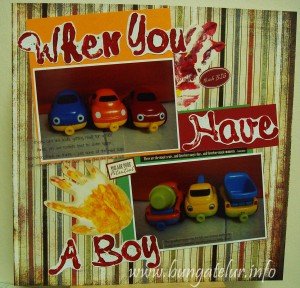
    Thanks to Scrap-It-Lah for running this mood board challenge. I’ve heard about mood board before but never thought about doing it for scrapbooking layout.


    (Please click to see a bigger image)

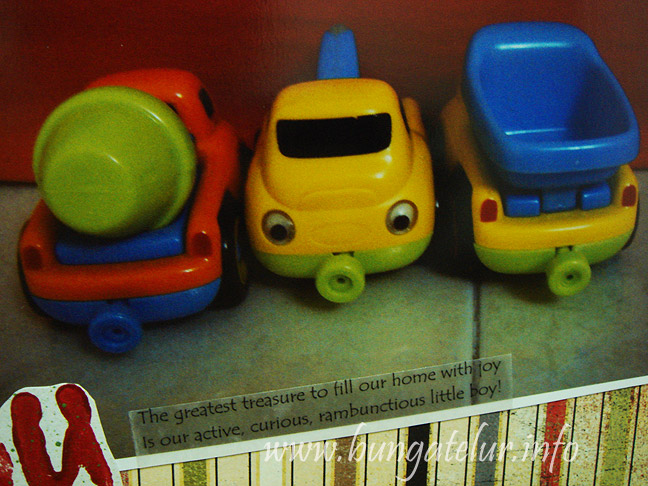
    It really helps me to get the feel and mood according to the pictures I’ve chosen for this challenge. I’ll tell you more about these pictures. My son has a great problem to fall asleep at night. Usually I will fall asleep before he does. What he will do is to take a few of his toys and play it by the bedside (or rather our mattress side..haha!), right at Mama’s feet while Mama tries to sleep.

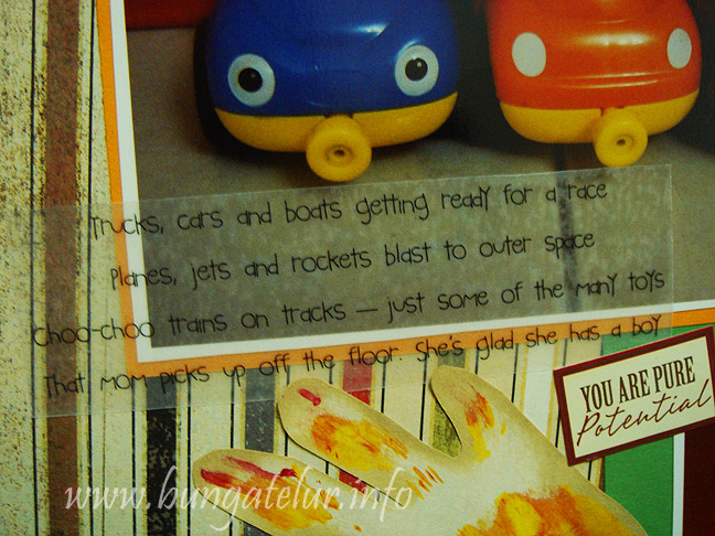
    So one day, when I woke up, I found his ELC car and truck toys were lining up nicely according to their type, right by the mattress – car with car, truck with cement mixer and tow truck..well, you know what I mean. I know I have to snap some pictures as a remark of his ability to categorize things. At 2 year of age, this is considered as an achievement in term of child development!

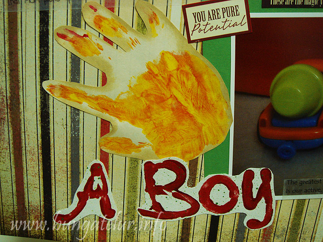
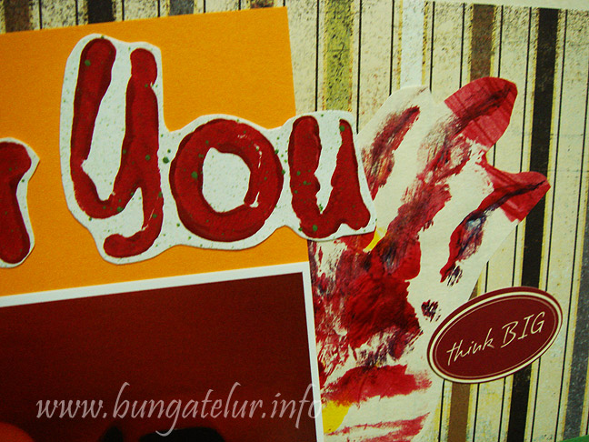
    So just as the Squidoo suggests, I brought those 2 pictures to my craft room and start putting items that I see fit with the mood of the pictures. I found those pieces of paper of his hand painted art which I plan to keep and I thought, hey this will fit nicely with the color of those cars and trucks..heh!

    I gathered many more possible items like ribbons, brads, and even flowers but after leaving it for 2-3 days and coming back to the room later, I decided this will do for the layout. I tried to be less critical and put on more things but somehow I realized that I am just a “less is more” type of scrapbooker.

    I also found some old vellum sticker that has suitable sentiments about having a boy.

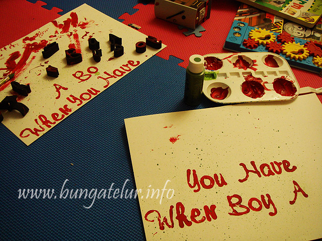
    And for the title, I decided to stamp the Pebble Inc alphabet foams using acrylic paint and then spray some green paint at the back using the paint brush…(it’s kind of ad hoc decision since I didn’t want to waste the green paint). These days I use the alphabet foams (which I bought since the past 4 years but never get to use them) to teach him ABC while doing some random, fun painting.

    Since my son now loves painting (or actually squeezing most of the paint out of their bottles into palette..huhu!), I decided to stamp the title with him in the play room. As you can see in the above in-the-making picture, I have to stamp twice as he smudged the first one. Well, that’s life when you have a boy..


  10. Flashback First 3D Project

    March 3, 2011 by admin

    I was browsing Shirl’s craft blog and found out about this great challenge at Flashback Friday Challenge.

    The Flashback Friday 8.0 is to share your first ever 3D project that you have done.

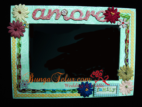
    I am so shy to share mine, but the truth is, here is the minimal looking frame I made as a gift to a friend back then in 2007 using whatever scrapbooking embellishments I have that time. The entry of the novice frame is here Decorated Frame With Scrapbooking Materials.

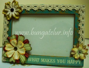
    And recently in 2010, I have made another one to be given to Hubby. I put our son’s picture in the frame so that Hubby can put in his work-from-home room.

    The frame was also entered into a challenge – Flowers and Frills.

    (Please click on the image to view larger version)

    I hope you can see that I made some improvement in my crafting. Aging does make people a bit wiser over the years, I guess..haha!